 P-Pod
P-Pod
P-Pod brand kit
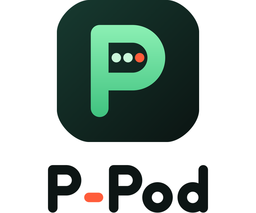
The mark is a P whose bowl is a pea pod. The peas are callers waiting in the channel, and the coral one is the caller who is on air. The wordmark uses the same rounded stroke, and its coral hyphen is the same on-air signal.
Logos







App icon & favicons
 512 / 256 / 128
 64
64 48
48 32 (simplified)
 16 (simplified)
 maskable (Android)
| File | Use |
|---|---|
| favicon.ico | Browser tab, 16/32/48 in one file |
| favicon.svg | Modern browsers, scales cleanly |
| apple-touch-icon.png | iOS home screen, 180×180 |
| icon-192.png · icon-512.png | PWA / Android icons |
| icon-maskable-192.png · icon-maskable-512.png | Android adaptive (full-bleed, safe zone respected) |
| safari-pinned-tab.svg | Safari pinned tab (monochrome) |
| mstile-150.png | Windows tiles |
| p-pod-mark-1024.png | App stores, social avatars |
| p-pod-mark.svg | Master vector mark |




Social sharing
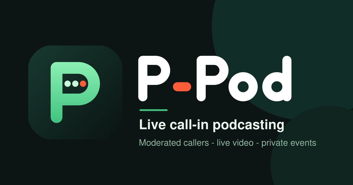 Show links like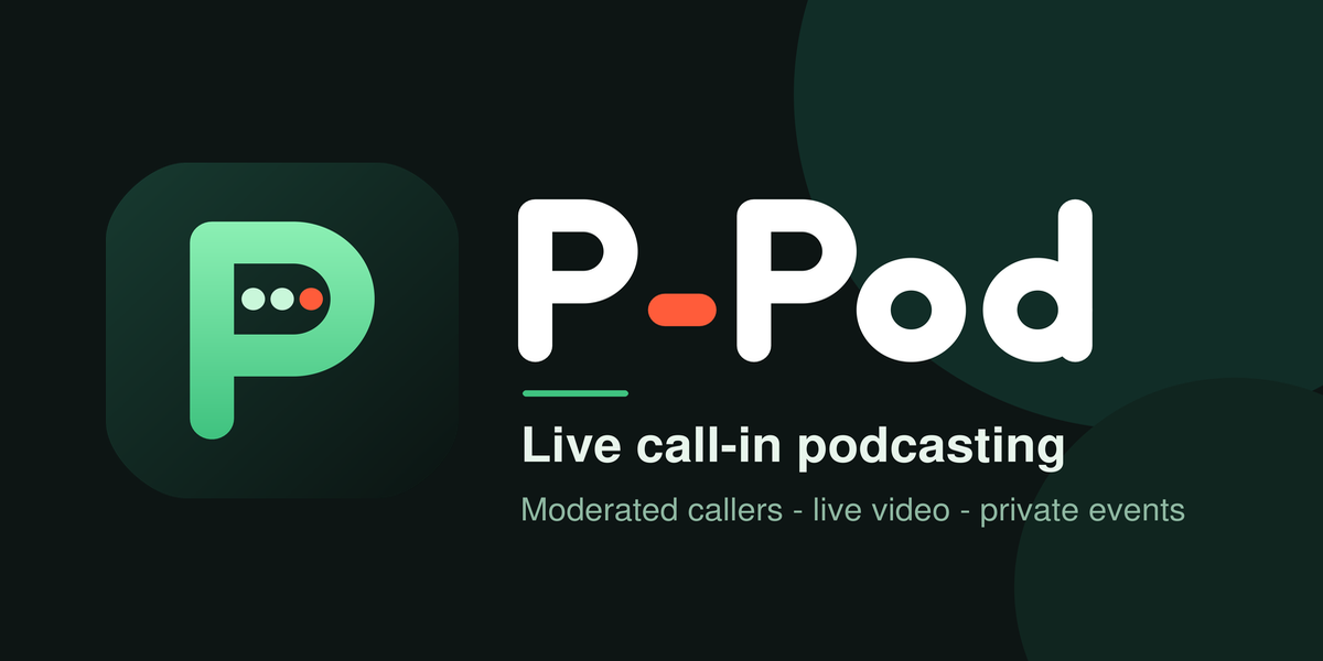
/@your-show automatically use the show's title and this image in link previews.
Color
Ink
#0D1514Pod green
#8CF0B4 → #3FC27FPod (UI, light)
#138A55Pod (UI, dark)
#6FE3A5On-air coral
#FF5C3APea
#C9F7DAPaper
#F5F8F4Usage
- Leave clear space around the logo at least as wide as the P's stroke.
- Don't recolor the peas. Coral means "on air" everywhere in the product.
- Below 32 px, use the simplified mark (one coral pea).
- Write the name as P-Pod: capital P, hyphen, capital P.
- Regenerate every file from one source with
python bin/brand/build_icons.py.